



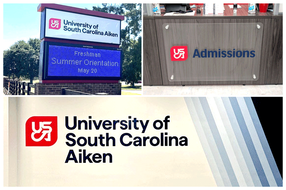
A great brand lives on screens. A lasting brand lives in the real world. Here is how one university turned its award-winning identity into signs that students and visitors see every day.
The Rebrand That Won Gold
The University of South Carolina Aiken launched a new identity in 2025. Local agency Wier Stewart led the creative work. The new logo, called the, "Double Knot", is based on a sculpture located on campus. The letters are stacked in pairs. This design echoes the 1960s, when the school was founded.
The rebrand includes new colors and a fresh visual system. The new palette keeps midnight blue and fire red. It adds goldenrod, orchid, sky, and poolside.
In 2026, the work earned a Gold MarCom Award, an international honor for marketing excellence. Freshman applications have risen 46 percent since the launch.
Why Physical Signs Matter in a Digital Rebrand
A logo looks sharp on a website. But a sign must work in rain, sun, and shadow. It must be readable from a moving car. It must match the exact brand color under fluorescent light. The transition from screen to wall is where many rebrands lose their way.
USCA faced this challenge across dozens of departments. The campus needed signs that felt like the brand. Not just close. Exact.
The Keen Signs Approach
Keen Signs and Graphics has worked with USCA on multiple projects. The team translated the new brand into physical signage. This included exterior signs, ADA compliant interior way-finding, and restroom signage. Building identification as well as vibrant wall murals and signs that make the brand, "pop" are also included. Different materials were required across campus. Each material required precise color matching.
The goal was simple. Every sign should look like it belongs to the same brand family. A student should feel the rebrand before they read a single word.
What This Means for Your Campus or Facility
A rebrand is not finished when the style guide is published. It is finished when the last sign is installed. Here are three questions to ask your sign partner before your next project.
Can you match our brand colors across different substrates?
Plexiglass, aluminum, and vinyl each absorb light differently. A color that looks bold on paper can look flat on metal. Your sign partner should test each substrate before full production.
Do you understand way-finding and ADA compliance, not just branding?
A beautiful sign that confuses visitors is a failure. Campus signage must balance brand identity with clear direction. The best campus signs do both.
Can you scale across multiple buildings?
A rebrand touches dozens of locations. Restrooms. Parking decks. Athletic facilities. Lecture halls. Your sign partner needs the capacity to produce and install at scale. One vendor is better than many.
About the USCA Rebrand Project
USCA launched its new identity during a community event in downtown Aiken on August 23, 2025. The work was completed in partnership with Wier Stewart. The MarCom Awards entry page includes the full project details and credits.
Related coverage:
- Post and Courier: USCA breaks down the why behind recent rebranding
- Post and Courier: What we know about USCA's expanded color scheme
- WJBF: Students welcomed back to USC Aiken, rebrand excitement builds
Keen Signs and Graphics is a full-service sign company in Augusta, Georgia. The team specializes in ADA-compliant signage, campus wayfinding, and brand implementation for education, healthcare, and commercial clients. Contact Keen Signs at 706-364-2151 or visit keensigns.com.
