



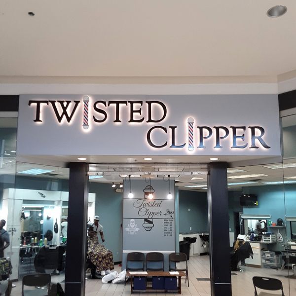
From the parking lot, they look like close relatives. Raised letters, mounted individually to the wall, spelling out a business name with real depth. We've written before about what goes into a dimensional letter sign and how it's built; but we often get asked how dimensional letters compare to their illuminated cousins, channel letters. So here's the side-by-side.
The two are built completely differently, and picking the wrong one means paying for a feature you don't need, or living with a sign that goes invisible every night at dusk.
The one-sentence difference
A dimensional letter is solid all the way through. It's cut from acrylic, metal, wood, or foam and finished to order. A channel letter is a hollow shell, built with returns and a back plate specifically so it can hold electrical components and light up.
That's the whole ballgame: dimensional letters are a fabrication product, channel letters are an electrical one. Everything else follows from it.
When dimensional letters are the right call
Dimensional letters shine indoors and in daylight. They're the workhorse behind reception desks and in lobbies all over Augusta. They're brushed metal logo on the wall of a law office, the painted acrylic letters in a medical practice waiting room. They're also part of a strong new-year lobby refresh, which we wrote about a few weeks back.
They're also the answer when your wall can't or shouldn't have electricity running to it: interior walls, leased spaces where running a circuit means a conversation with the landlord, and buildings where the sign location is nowhere near a power source.
And there's an aesthetic argument. Dimensional letters give you that clean, dimensional shadow-line look without any visible illumination; which is exactly the look a lot of professional offices, churches, and boutiques want. Decorative finishes (brushed metal, painted, wood-grain) are far more varied, too.
When channel letters are the right call
The moment your sign needs to work after dark, channel letters take over. They're the standard for storefronts and building exteriors for one simple reason: a lit sign is a working sign during the exact hours your customers are driving past.
Ask yourself one question: when does my customer make the decision to stop? If the answer is "on the way home from work," "after church," or "at 9 p.m. when the game lets out," you need a sign that's on at 9 p.m. A dimensional letter wall that looks fantastic at noon is a silhouette at nightfall.
Channel letters also earn their keep on buildings with roadside visibility. If your sign competes with a four-lane road instead of a parking lot, illumination isn't a luxury.
Three questions before you decide
- Will the sign live indoor or out? Interior signs often go dimensional; exterior depends on your hours and your traffic.
- Is there power at the wall? If not, that's not necessarily a deal breaker for illumination, but it's a question to ask before you fall in love with a design.
- When are your customers actually passing by? Your sign should be on duty for the hours that matter to your business, not just business hours.
How Keen Signs Makes This Easy
You don't have to know any of the above before you call. We'll look at your building (or your floor plan), talk through when and how your customers find you, and tell you honestly whether dimensional letters, illuminated channel letters, something else fits. Everything is designed, fabricated, and installed by our team at our Broad Street shop in downtown Augusta.
If a sign refresh is on your list for the new year, the best time to start the conversation is now - while the production calendar still has room in it. Request an estimate at https://www.keensigns.com/estimate-request.html or give us a call at (706) 364-2151.
